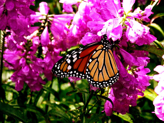
I found a butterfly!
These are slightly less artistic than my usual photos, but I got pretty close to this butterfly....So I figured I'd share.
Enjoy!
Tuesday, September 20, 2011
Friday, September 9, 2011
Saturation: Compare and Contrast
Pictures Go!


So, these are Black-eyed Susans. According to Wikipedia, the scientific name is Rudbeckia hirta, and some common names are: Brown-eyed Susan, Blackiehead, Brown Betty, Brown Daisy, Gloriosa Daisy, Golden Jerusalem, Poorland Daisy, Yellow Daisy, and Yellow Ox-eye Daisy.
So yeah, I took these a few weeks ago.....My favorite is the top one, because the background is more brownish than green, and I think it brings out the details in the flower better. And it's a super-macro, so of course there's more detail.
With these photos, I really couldn't decide whether I liked them saturated or unsaturated (left and right respectively). I look at the left one and think....that's really cool looking...then I look at the right one and think...wait, I like this one better. But, the left one is really colorful...and I like that one. I can't decide.
What do you think; rich and colorful, or faded and artsy?
Monday, September 5, 2011
Trees and a Church
So, last week I moved back into school. And then I didn't post anything for that week. Sorry...Here's some fancy new photos to make up for it.
So, as usual the title says just about everything.... The first picture is a tree with a nail in it. The second and third are some cool shots up some trees. And the last one is a cool church....I don't remember what church. These all have my usual extra contrast boost, which I've noticed washed out the sky in these pictures. However...I kind of like it. It makes the white sky (obviously) contrast the brown of the trees and church better.
That's it for now, more posts to come (hopefully) soon.
Also, blogger has a new posting interface....Not sure what I think of it.... It looks like Google Docs now.
Subscribe to:
Comments (Atom)


